Thursday, April 26, 2012

http://maps.google.com/maps/ms?msid=208586145485020522765.0004be37131319b4c4ba5&msa=0&ll=42.163403,-96.240234&spn=38.318629,79.013672

              For better or for worse, the US News and World Report rankings have become integral to how high school seniors view colleges.  The rankings, which are debatably arbitrary, create a hierarchy of universities that often dictates where students apply to and attend.  This map examines the university rankings from a geographic viewpoint in order to see if there are any geographic biases or trends in the schools that get the top rankings.  Evidently, the northeast has monopolized the rankings, as eight of the top twenty-five and all of the top four universities are located between Washington D.C. and Boston.  Another unexpected trend is the lack of highly ranked universities on the West Coast.  In fact, outside of California, there are no universities in the top twenty west of the United States’ geographic center.
               Most of the pit-falls of neogeography lay either incorrect interpretation of geographic data.  For instance, one could conclude from my map that higher education is simply better on the east coast, yet this is a flawed assertion.  This map is only a map of the top-ranked universities, which are not necessarily the twenty-five objectively best universities.  In addition, mashups cannot communicate certain data that might be influential to the interpretation of the map.  For instance, UCLA and the California Institute of Technology both appear as equal sized pins on the map, yet UCLA has over thirty times the undergraduate enrollment of Cal Tech.  In this way novice mapmakers can create misleading mas that lend themselves easily to false interpretations.

Thursday, April 19, 2012


1.      What is the name of the quad?
Beverly Hills Quadrangle
2.      What are the names of the adjacent quadrangles?
Canoga Park, Van Nuys, Burbank, Topanga, Hollywood, Venice, and Inglewood
3.      When was the quadrangle first created?
This quadrangle was created in 1966.
4.      What datum was used to create your map?
The North American Datum of 1927, the North American Datum of 1983 and the National Geodectic Vertical Datum of 1929 were all used to create this map.
5.      What is the scale of the map?
The scale of this map is 1:24,000.
6.      A) 1200 meters.
B) 1.89 miles.
C) 2.64 inches.
D) 12.5 centimeters.

7.      What is the contour interval on your map?
The contour interval is 20 feet.  In particularly flat areas, the map uses supplementary contours of interval 10 feet.
8.      What are the approximate geographic coordinates in both degrees/minutes/seconds and decimal degrees of:
A)     the Public Affairs Building
118° 26’ 15” W, 34° 04’ 33” N;  or 118.44° W, 34.08° N
B)     the Tip of Santa Monica Pier
118° 30’ 0” W, 34° 00’ 26” N;  or 118.50° W, 34.01° N
C)     the Upper Franklin Canyon Reservoir
118° 24’ 35” W, 34° 07’ 12” N;  or 118.41° W, 34.12° N
9.      What is the approximate elevation in both feet and meters of:
A)     Greystone Mansion (in Greystone Park)
Greystone mansion is on hilly terrain of elevation 560-580 feet (170-180 meters).
B)     Woodlawn Cemetery
The elevation is 140 feet (40 meters).
C)     Crestwood Hills Park
The elevation of Crestwood Hills Park ranges from 600-840 feet (180-250 meters)
10.   What is the UTM zone of the map?
The subject of the map is located in UTM zone 11.
11.   What are the UTM coordinates for the lower left corner of your map?
The coordinates are 3,763,000 meters north and 361,000 meters west.
12.   How many square meters are contained within each cell (square) of the UTM gridlines?
Each cell represents an area of one million square meters.
13.   Obtain elevation measurements, from west to east along UTM northing 3771000, where the eastings of the UTM grid intersect the northing.  Create an elevation profile using these measurements in Excel.  Figure out how to label the elevation values to the two measurements on campus.  Insert your elevation profile as a graphic in your blog.
In the following graph, the x-axis represents UTM meters east and the y-axis represents feet of elevation.
14.   What is the magnetic declination of the map?
The magnetic declination of the map is 14°.
15.   In which direction does water flow in the intermittent stream between the 405 freeway and Stone Canyon Reservoir?
The water travels due south.
16.   Crop out UCLA from the map and include it as a graphic in your blog.

Friday, April 6, 2012

source: http://i42.tinypic.com/jzfdzr.jpg


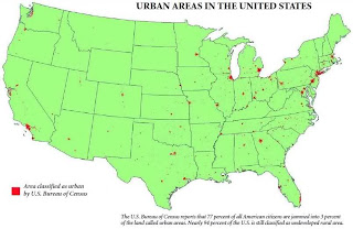
This map shows the urban areas of the United States in red, and the uninhabited or sparsely populated areas in green.  What is most striking about this map is that it shows how little of the US land has been developed.  According to the photo's source, the red areas on the map hold 77 percent of the US population and just 3 percent of the nation's land.  The remaining population is squeezed into just another 3 percent of the land area.  I find it reassuring that, for all of the natural landscapes and ecosystems that our society has covered in housing, offices, freeways, and other infrastructure, we have left so much land untouched.


source: https://blogger.googleusercontent.com/img/b/R29vZ2xl/AVvXsEjqtEVodSVml3V3IEWDPu-02FYI3ranwAxbTlCSQXR-1xM8nxGeyRYX-Wbyhfk1B05DS9_8DCOUf9iP0Cyts8Oq2xDDpBffiEnYftA60KoMmC-5-RlQLvAN_xLF7rJxrdYso8Olk5TCkPU/s1600/asianmap1+%25281%2529.jpg

This map displays the Asian population of each county in the United States by percentage.  California clearly has the highest Asian population, followed by New York City and Seattle.  There is a larger proportion of Asian Americans living on the west coast than on the east coast.  This trend is expected, as the most immigrants from the Asian continent arrive to the United States via the Pacific Ocean.  What is more curious, however, is that the Asian population is concentrated in large cities.  Even in the east coast cities of Washington D.C. and New York, there is a sizable Asian population.  This map brings up a series of questions.  Why does the Asian population of the United States concentrate in cities?  Do all migrant groups tend to congregate in cities?  Do all nationalities of Asian Americans gravitate toward cities, or do some nationalities tend towards the suburbs or rural areas?  I like this map because it presents so many questions, but unfortunately it does not answer them.


source: http://map.itoworld.com/road-casualties-usa#

This map displays the locations of all of the documented road fatalities on the United States from 2001-2009.  While it is difficult to see in the above thumbnail, the dots are color-coded.  A purple dot indicates a vehicle occupant fatality, a blue dot indicates a pedestrian fatality, an orange dot indicates a cyclist fatality, and a green dot indicates a biker fatality.  Along interstates and suburban roads, the vehicle occupants comprise the majority of the deaths.  In densely populated regions, such as Manhattan or San Francisco, pedestrians are the primary victims.  In fact, there were very few vehicle occupant deaths in these two places.  Sprawling cities, on the other hand, show the opposite trend (look at Kansas City).  The information in this map could be used to help municipal traffic safety departments better assess their regions' specific problems.