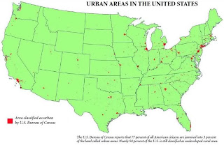
This map shows the urban areas of the United States in red, and the uninhabited or sparsely populated areas in green. What is most striking about this map is that it shows how little of the US land has been developed. According to the photo's source, the red areas on the map hold 77 percent of the US population and just 3 percent of the nation's land. The remaining population is squeezed into just another 3 percent of the land area. I find it reassuring that, for all of the natural landscapes and ecosystems that our society has covered in housing, offices, freeways, and other infrastructure, we have left so much land untouched.
source: https://blogger.googleusercontent.com/img/b/R29vZ2xl/AVvXsEjqtEVodSVml3V3IEWDPu-02FYI3ranwAxbTlCSQXR-1xM8nxGeyRYX-Wbyhfk1B05DS9_8DCOUf9iP0Cyts8Oq2xDDpBffiEnYftA60KoMmC-5-RlQLvAN_xLF7rJxrdYso8Olk5TCkPU/s1600/asianmap1+%25281%2529.jpg
This map displays the Asian population of each county in the United States by percentage. California clearly has the highest Asian population, followed by New York City and Seattle. There is a larger proportion of Asian Americans living on the west coast than on the east coast. This trend is expected, as the most immigrants from the Asian continent arrive to the United States via the Pacific Ocean. What is more curious, however, is that the Asian population is concentrated in large cities. Even in the east coast cities of Washington D.C. and New York, there is a sizable Asian population. This map brings up a series of questions. Why does the Asian population of the United States concentrate in cities? Do all migrant groups tend to congregate in cities? Do all nationalities of Asian Americans gravitate toward cities, or do some nationalities tend towards the suburbs or rural areas? I like this map because it presents so many questions, but unfortunately it does not answer them.
This map displays the locations of all of the documented road fatalities on the United States from 2001-2009. While it is difficult to see in the above thumbnail, the dots are color-coded. A purple dot indicates a vehicle occupant fatality, a blue dot indicates a pedestrian fatality, an orange dot indicates a cyclist fatality, and a green dot indicates a biker fatality. Along interstates and suburban roads, the vehicle occupants comprise the majority of the deaths. In densely populated regions, such as Manhattan or San Francisco, pedestrians are the primary victims. In fact, there were very few vehicle occupant deaths in these two places. Sprawling cities, on the other hand, show the opposite trend (look at Kansas City). The information in this map could be used to help municipal traffic safety departments better assess their regions' specific problems.


No comments:
Post a Comment