Thursday, May 31, 2012


This map displays the distribution of the African American population of the United States in 2000.  The data shows the percentage of each county's population that identifies as African American.  As is apparent, the South is predominantly black, while the West and Northeast have significantly smaller percentages of black residents.  The black population is particularly small in the Great Plains states of Minnesota, Iowa and Montana.
This map shows the distribution of the Asian American population in the United States.  Much like the black population, the Asian population in heavily concentrated in a few counties.  These counties tend to be urban, such as Los Angeles County or San Francisco County, and they tend to be located on the West Coast.  This makes sense, as Eastern Asia is nearest to the western United States.  In addition, because the Asian population immigrated to the United States much more recently than the African American population, it makes sense that the former has tended to congregate in urban areas.
This map shows the distribution of Americans who identify as belonging to another race, other than Caucasian, black, or Asian.  These Americans are heavily concentrated in the Southwest, in the four states that border Mexico.  It can be inferred that the majority of these Americans identify as Latino, and are predominantly come from Spanish-speaking countries.  Thus, California, Arizona, New Mexico and Texas are the primary destinations for these immigrants.  A notable contrast between the distribution of this group and that of Asian Americans is that while the latter tends to congregate in cities, the former populates both urban and rural counties.

This map exercise was enlightening about the spatial settlement patterns of different American races.  It showed where African Americans, Asian Americans and--presumably--Latino Americans tend to settle, and brought up some intriguing similarities and contrasts.  One the the most striking similarities between the settlement patterns of the three races is that all three groups tend to concentrate in specific areas.  However, these areas were drastically different for each race.  African Americans tend to live in more rural counties of the south, a pattern which is likely a vestige of the institution of slavery.  Asian Americans do the opposite, concentrating in cities on the West Coast.  The Latino population is concentrated near the border with Mexico, which is likely due to a combination of the fact the those four states are accessible from the south and that those four states have string agricultural industries.

Ultimately, I believe that GIS has a lot of potential as a field.  Combining different types of data (county borders, census population, bordering regions etc.) can bring to light patterns in societal development that would otherwise go unseen.  Using GIS, government officials can gain insight into such simple issues as the negative noise effects of an airport to such complex issues as the regulation of immigration.  The inference that one makes with the data is still the most significant part.  With proper inference techniques, GIS can be a powerful tool.

Friday, May 18, 2012

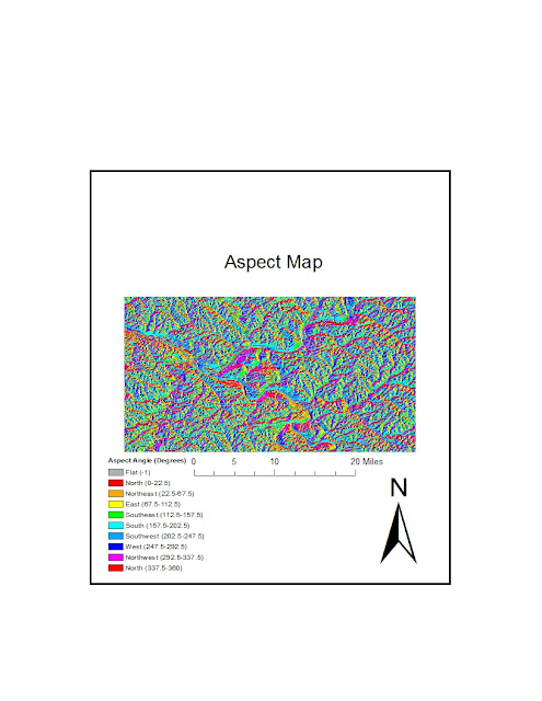
       For this week's lab, I chose to map the city of Pittsburgh, Pennsylvania.  The hilly city is located at the intersection of three rivers and thus has unique topographical features.  For example, the city's steepest slops occur at the edges of the rivers.  All of the following maps depict the same region: the area bordered by 40.30303 degrees North and 40.58202 degrees North and by -80.16993 degrees and -79.64664 degrees longitude.   The final graphic on this blog is a three-dimensional map of the city's topography.  The USGS source data for the maps employed the GCS_North_American_1983 coordinate system.

Saturday, May 12, 2012


                This assignment revealed many interesting aspects of the map projection process.  The first piece of information I learned was that there are several different ways to measure distance between two points on a map.  In addition, different map projections represent these distances with different values.  For example, using the planar measurement, Kabul to Washington DC was 10,141 miles in the Mercator Projection, 8,329 miles in the Hammer-Aitoff Projection, 9,919 miles in the Stereographic Projection, 8,341 miles in the Azimuthal Equidistant Projection, 8,763 miles in the Behrman Cyinder Projection, and 6,919 miles in the Two-Point Equidistant Projection.  Overall, the Great Elliptic and Geodesic measurements were the most consistent (and always identical to each other) while the Planar measurement was the least consistent.  The rest of the data is stored in the table below.
                While no map was perfect, each projection had strengths and weaknesses.  The Hammer-Aitoff Projection and the Behrman Cylinder Projection were both very good at preserving areas; Greenland was not bloated like it is on most maps, and Africa took up its due space.  However, in the Hammer-Aitoff Projection, the shapes of the Pacific Rim nations (such as China and the United States) are heavily bent.  In the Behrman Projection, Africa is stretched vertically and Greenland is squished vertically.  Both maps, in this sense, fail to convey the shapes of the world.
                The Stereographic Projection and the Mercator Projection both preserved the shapes of individual countries nicely.  In both projections, the United States looks like it does on the globe.  The same is true with Greenland and with China.  However, the relative areas of these countries differ greatly from reality.  In the Mercator Projection, Greenland looks bigger than the continent of Africa.  Even more peculiar is the Stereographic Projection, in which the United States was rotated on its side about seventy degrees and Australia appears several times the size of South America.  The planar distances in these two maps between Washington DC and Kabul also differ the most from the actual distance.  Likewise, the equidistant maps had shortcomings.  Both the Azimuthal Projection and the Two-Point Equidistant Projection reported relatively accurate planar distances between the two cities, but distances between more Pacific cities came out distorted and the shapes of countries were very inaccurate.
                For most applications, it seems a hybrid map style is most suitable to depict the world.  An equal area map will distort angles and distances.  A conformal map will distort distances and areas and an equidistant map will distort angles and areas.  In a few applications—such as examining the missile range of North Korea—one of these three partially perfect styles may be needed.  But in most cases, one must compromise in order to get a good depiction of the globe’s geography.  For most applications, the best map will have slightly inaccurate angles, distances and shapes.  That way, none of the three elements is too distorted.


Projection Type: Hammer-Aitoff Behrman Stereographic Mercator Azimuthal Two-Point
Planar Distance 8,329 miles 8,763 9,919 10,141 8,341 6,919
Geodesic Distance 6,934 miles 6,934 6,934 6,934 6,934 6,919
Loxodrome Distance 8,112 miles 8,112 8,112 8,112 8,112 8,093
Great Elliptic Distance 6,934 miles 6,934 6,934 6,934 6,934 6,919

Thursday, May 10, 2012


               Geographic Information Systems have both potential and pitfalls.  One of the great aspects of GIS, and in particular ArcGIS, is that it can be precise with information.  For instance, on the airport map, the user can zoom in far enough to see if Northwestern Prep is within or not within the noise contour.  The ArcGIS is also precise with the parcel boundaries and the land use boundaries.  GIS allows for the precision of information that cannot be obtained without using computers.
                GIS also allows for the efficient synthesizing of data.  This is in part due to the fact that ArcGIS can hold lots of pieces of data: population counts, parcel boundaries, land use patterns, school names, arterial locations etc.  Such large volumes of data would be difficult to store with computer software.  What gives GIS so much potential, however, is that it can combine data sets with almost no effort.  For instance, the user can create a map of population density easily by combining the population-per-parcel table with the area-per-parcel table.  Such a calculation would be painfully tedious and easy to mess up without software.
                GIS does have some problems, though.  The first is that it is prone to user error.  The ArcGIS software is complicated, with many different toolbars and buttons.  It can be easy for a neo-geographer to get lost in all of the controls, even when using a tutorial.  He or she can easily spend more time and effort trying to figure out how to use the software than trying to analyze the geographic data.  In this sense, GIS software can be a potential distraction to the user if their task is simple.
                Lastly, GIS software helps the user organize the data, but it does not provide analysis.  The user still must interpret all of the maps that he or she creates.  Perhaps, the greatest pitfall of GIS is that it can give the user so many tools to create maps that he or she forgets to interpret them.  At the end of the day, the most valuable skill a geographer can attain is the ability to use maps to make policy decisions (or other types of decisions.)  GIS cannot do this for the user; it is simply a tool to make the analysis easier.